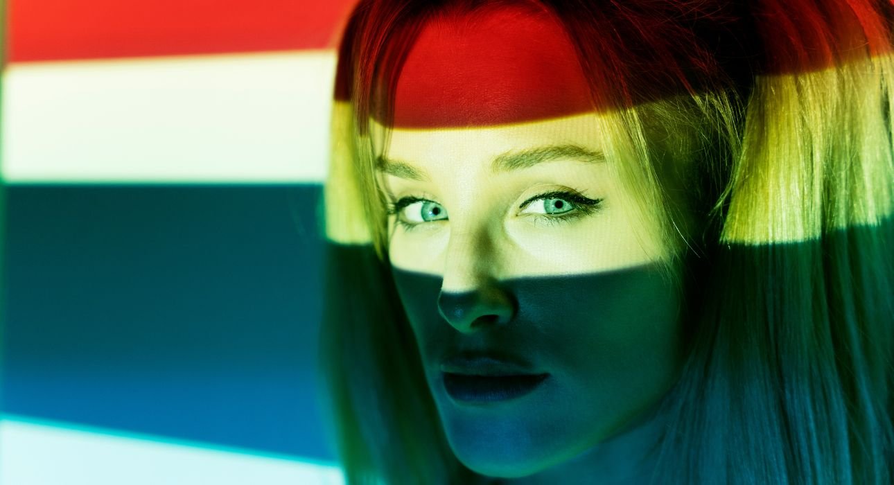
Colors once screamed — neon pinks, graphic reds, electric blues that screamed for attention. But of late, design has learned to relax. Gone are the days when colour demands notice, replaced by colour that invites feeling. Fade palettes, misty segues, and quiet gradients are in the ascendant — whispering but conveying so much more. These are the chromatic whispers — visual tones that hum, not sing.
They lead the eye, establish mood, and allow viewers to feel something without overwhelming them. And with creative tools like Dreamina’s AI photo generator, such subtle shifts are now simpler than ever to achieve. You can paint with feelings, not pixels, adding atmosphere, tone, and intimacy to every image. Soft gradients tell, rather than decorate. They imply time elapsing, light changing, and feeling unfolding. They breathe like life — naturally, smoothly, and deeply human.

The gentle transformation of colour narrative
Colour in contemporary design isn’t a shouting declaration — it’s a whispered conversation. Rather than bold contrast, brands are venturing into subtlety: how two colors mingle, how temperature alters from one point to the next within an image, how the eye wanders from one tone to another. Subdued gradients narrate tales of serenity, delicacy, and rapport. From blush to beige could be a nostalgic gesture; from blue to lavender, a subtle hint at trust.
These decisions speak volumes more than monolithic heaps of color can. What’s great about this shift is restraint. Designers are discovering that less contrast creates more depth. That peaceful visuals engage longer than frenetic ones. That feeling often resides in transition, not in definition.
Why gradients feel human
Soft gradients reflect the way we see the world. Light never stops suddenly; shadows disappear; sunsets merge. Our eyes are designed to appreciate slow change. That’s why subtle color transitions feel natural, human, and reliable. A brand employing gradients appeals to that instinct. It doesn’t scream for attention — it earns it, through balance and continuity. Gradients can also convey personality without words.
- A warm-to-cool gradient feels welcoming but contemporary.
- A monotone gradient with changing opacity brings subdued elegance.
- A pastel fade emits nostalgia or closeness.
With every subtlety of tone, the brand makes rhythm — a visual beat that’s like a heartbeat. At the same time, for artists fine-tuning tones or achieving greater realism, subtle gradient control is easy with the AI image editor. You can fine-tune saturation drift, sharpen blending edges, or add soft vignettes that slowly draw the viewer in towards the message.
Gradient storytelling in design and brand
In digital advertising, gradients have become emotional landscapes. They’re employed in:
- Ads that must invoke feeling immediately, without depending on intricate visuals.
- Social media imagery that pops with softness, not contrast.
- Packaging in which gradients repeat material texture or mood.
- Web design where fluid color flow leads user’s eyes organically.
Strongest designs pair story and spectrum — using gradients as atmosphere, not ornamentation. The colors themselves convey the emotional undertext of the brand.
Synthesising emotion and Dreamina
Dreamina lets designers kind of paint with this real softness. You know, turning those deep feelings into gentle gradients and textures that hit you right in the emotions. Like, if you’re making a background that comes off like a quiet sigh or a logo with that soft dusk glow hanging around it, Dreamina turns the whole thing real. It goes beyond just spitting out images. It grabs hold of the mood, you know.
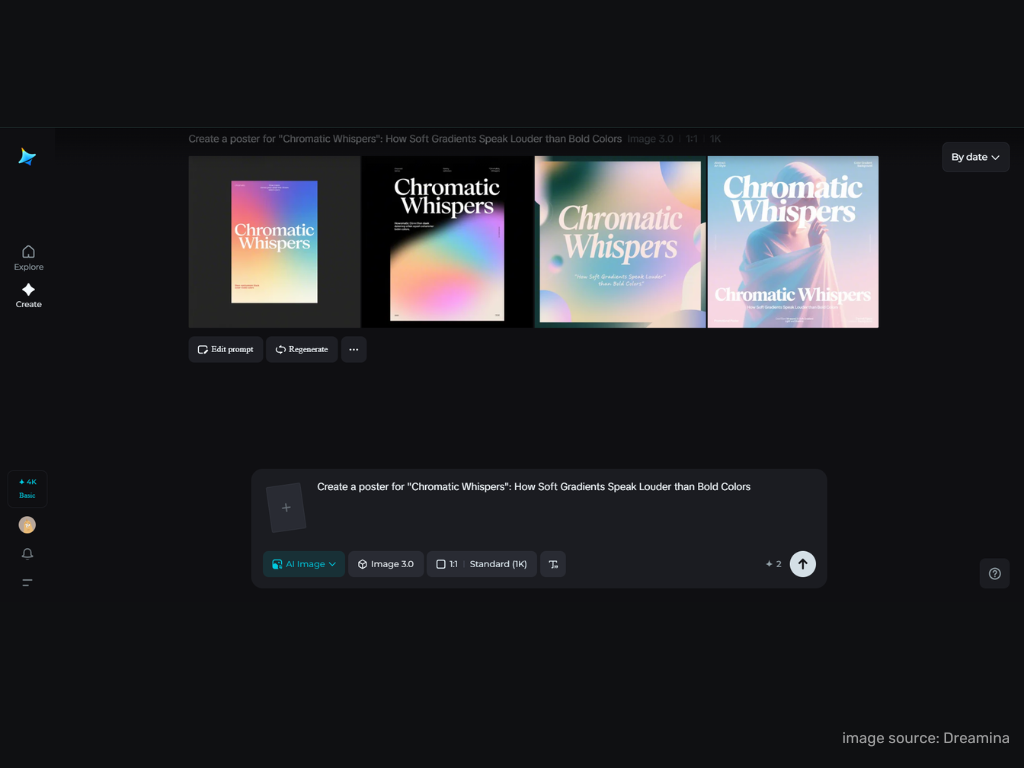
Step 1: Write a text prompt
Start by going to Dreamina and defining your gradient idea with precision. Emphasize transitions, mood, and lighting — what feeling do you wish your colors to convey? For instance: A peaceful background with a muted gradient from rose quartz pink to misty lavender, soft lighting, low texture, inviting calm and coziness.
Step 2: Set parameters and generate
Next, set your creative canvas. Choose the model, aspect ratio, size, and resolution (select 1k for light previews or 2k for high detail rendering). These parameters determine how your colors transition — tighter for smoother transitions or wider for atmospheric fade. When you are ready, click Dreamina’s icon, and in seconds, your gradient design will be generated. The colors will move like emotion — generally breathe across the frame and meld tone and texture in such a way that the human eye recognizes it as natural right away.
Step 3: Personalise your image and save it
Using Dreamina’s advanced editing tools, fine-tune your image. Use inpaint to soften edges or merge light; expand to extend the gradient naturally; remove to remove sharp contrast; retouch to tone down tonal balance — adding precision, without disturbing the emotional rhythm. When you feel balanced — not completely calm, but definitely alive, click Download and save. You’ve just painted emotion with light.
When color becomes personality
Gradients are emotional fingerprints. They are never the same, and each one has a slightly different story to tell. They have become imperative in brand storytelling, particularly in industries that are based on feeling — wellness, design, hospitality, or digital art. They complement well with the AI logo generator, which assists brands in infusing soft color transitions into clean logos, developing identities that are fluid and accessible instead of fixed.
Rather than being static symbols, these logos flow — implying openness, empathy, and evolution. These subtle adjustments transform gradients into mood tools — each tweak moves the emotion a little, as when a musician alters tempo to enrich a song’s meaning.
The emotional logic of muted color
What draws soft gradients so powerfully isn’t beauty alone — it’s psychology. They seem alive because they are mimicking human experience. Emotions don’t change in binaries; they fade, ripple, and blend. So when we witness a color that also changes the same way, we sense ourselves reflected. Sober color schemes create room to breathe. They compel viewers to stay a while.
They allow meaning to expand instead of being presented at once. Brands employing them are not so much creating visuals as creating trust. The subtle strength of the gradient narrative is found in the balance between light and shadow, visibility and reserve, heat and cold. Like the cadence of a deep breath, it reminds us that loveliness doesn’t have to yell.
Where gradients turn into memory
With changing color trends, soft gradients will remain at the helm, not because they’re trendy, but because they’re compassionate. They are what we yearn for — serenity, togetherness, substance. Dreamina lets designers shape that inner pull into something real. It turns feelings into pictures that carry a warmth you can almost touch. You might be working on brand looks or digital ads, or even packaging that captures a certain mood. Dreamina brings the hidden pulse of colors right into view. Sometimes the real power comes through subtle shifts in color. Not the bold ones that shout. Gradients whisper it all instead.